
Choosing an exterior paint color feels fun until the samples hit the wall. The soft gray from the photo suddenly looks cold. The creamy white turns yellow beside the roof. That deep green looked elegant online, but on this house, under direct sunlight, it feels much darker than expected.
A tiny paint chip cannot show what a color will do across a full wall. An inspiration photo does not include your home’s windows, trim, stone, landscaping, roofline, or street setting either. The real goal is not to find the perfect color in a store. It is to choose a paint color that belongs on your actual house.
What Color Experts Say About Home Painting Trends 2026
Home painting trends 2026 are becoming warmer, richer, and less flat. Color experts are pointing toward grounded, expressive, and authentic spaces instead of the colder gray palettes that dominated for years.
The direction includes:
It is a continuing shift, not a rulebook, so homeowners still need to decide what works with their actual exterior. Sage green may feel relaxed on one home and strangely flat on another. Dark charcoal can bring drama, but it needs balance from the trim, windows, and landscaping. Warm beige can feel classic on traditional homes, though the undertone still has to agree with any brick or stone nearby. Earthy colors and deeper palettes may be gaining momentum, but your home still has to approve the choice.
Start With What Is Already There
Before choosing a paint color, look at the pieces you are not changing:
This is one of the simplest tips, but it is also where many exterior palettes start to make sense, especially when nearby homes sit close to the property line or share a similar architectural style.
A house with warm brick usually needs a different palette than a house with cool gray stone. White windows can make dark colors read sharper. Black windows can make the same color feel more modern. Brown roof shingles often play better with creamy, earthy, or warm neutral colors than with cool blue-gray paint. If the fixed features do not agree with the sample, that is usually a clear sign to keep looking. This step is not glamorous. It is also the step that saves the most regret.
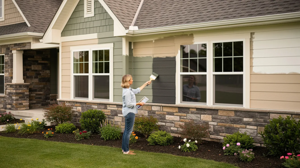
Test Paint in More Than One Place
Do not trust one sample in one spot. Paint changes all day. Morning light can make a color feel cool. Afternoon sun can pull out yellow, red, or brown undertones. A shaded wall may read much darker than the front of the house. Trees can throw green reflections across the surface, thanks to the way greenery bounces light back onto siding. Even the street around the home can change how the color feels.
Test a small range of colors on more than one side of the house. Check them in the morning, midday, and evening. Stand close. Then stand near the curb. Look from the inside too, especially through the living room or dining room windows. You may discover that a color looks calm from the street but too heavy from the room you use most. You will see that exterior color every day from the inside, not only from the driveway. If a color only looks good for one hour, take it as a sign that it is probably not ready.
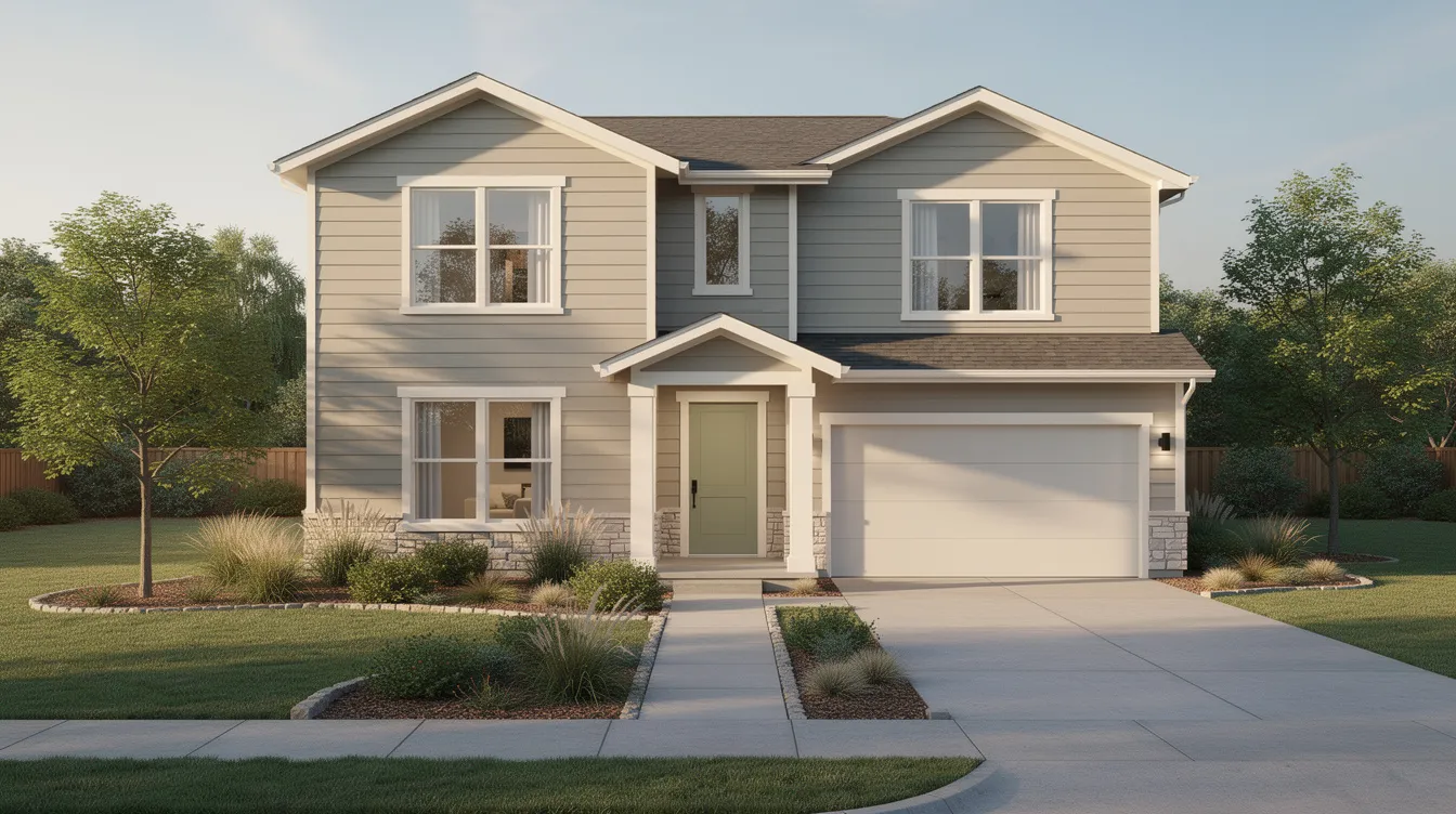
Build the Whole Palette Together
The main paint color is only part of the exterior. Trim, doors, shutters, and accents can make the house feel balanced — or busy. A front door can add personality without turning the whole house into a statement. Dark accents can create contrast. Soft neutral trim can calm a stronger body color. A creamy trim can make deep green or charcoal easier to live with, especially when the goal is to enjoy the color for years instead of only liking it on the first sunny day.
The mistake is choosing the body color first and treating the trim and door as leftovers. That is how a home ends up looking flat, or worse, like three different ideas were forced together.
A better approach: build the palette at the same time. Body, trim, door, shutters, and accents should connect. They do not need to match. They just need to stop arguing.
Be Careful With Dining Room and Other Interior Inspiration
Interior trends can help, but they do not always move outside cleanly. “Comfortcore” focuses on creating calm, relaxing spaces, which makes sense indoors, where furniture, lighting, and soft materials support the mood. A moody dining room can handle deep teal for the same reason. Outside, that same paint color has to cover a larger surface, live in changing weather, and sit in the real world with roofing, landscaping, and neighboring homes.
That does not mean bold colors are off limits. It means scale matters. Dark exterior colors like Black Satin are popular choices now, but a dramatic hue may still work better on the front door than on the whole house. A dark gray may need warm wood, greenery, or creamy trim so it does not feel too severe. Modern home paint ideas are best when they are adjusted to the house, while more traditional exteriors may need quieter contrast and softer transitions. The point is to explore the idea, not copy it directly from another space.
Do Not Rush the Final Choice
Most regrets come from moving too fast. Homeowners see a trend, save lots of photos, select a color, and hope it works. Sometimes it does. Often, one undertone is off, and the whole exterior feels wrong.
A better process is boring but safer:
Thanks to that slower process, you can learn which shades stay balanced instead of trusting the one that looked best for a few minutes. Acknowledge what the house already has instead of trying to fight it.
Then speak with local painting professionals before committing to an exterior color. A good exterior palette should make the house feel more settled, not louder for no reason. It is also easier to share a clear direction when the whole setting is visible.
The right color does not need to shock the neighborhood. It should make people look at the home and think, yes, that makes sense.